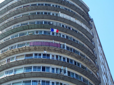
Curvy architecture processed for the Web in Photoshop Elements
When I bought my new Mac I got a free CD of Elements 2.0.
I'm finding that using it there are some interesting differences between the basic set-up of Photoshop and that of Photoshop Elements:
Elements vs Photoshop
1. I found it surprising that Elements has features that Photoshop doesn't (because Elements is much less expensive).
2. Photoshop Elements has a very effective Browse option. I like it better than Photoshop because Photoshop CS 2's Bridge program (Photoshop has a separate program packaged in called Bridge) because it's faster. While the images aren't as big in the preview; I find that speed is more important under my work circumstances.
3. Elements has a sidebar window where you can locate your files from a list of file names. It's easily seen, fast and very accessible.
Photoshop vs Elements
1. The drop down menu bars in Photoshop have more options and are easier to navigate to.
2. There are fade options in Photoshop CS 2 where you can lessen a previously made change with a slider.
3. There's a channel mixer in Photoshop which allows for better control of the gray tones when changing a color photograph to black-and-white.
These are some I've found. Please comment if you've found a couple...


 2 ... 2 ...
0 comments:
Post a Comment